
 15 min read


If you're looking to create a website design for your B2B company that really stands out, you're in the right place. In this blog post, we will discuss 18 different ways that you can set your website apart from the competition. By following these tips, you will be able to create a website that looks great and helps you generate more leads and sales.
Key Differences Between B2C and B2B Websites
 Before we dive into the actionable tips, it's important to understand some key differences between B2C and B2B that you need to take into account when designing your website.
Purchasing Process
One of the biggest differences between B2B and B2C buyers is that the purchasing process is often much longer for B2B products. This means that your website needs to be designed in a way that helps guide users through this longer purchase process.
Psychological Factors
Another key difference is that B2B buyers are typically more rational in their decision-making, as they often have protocols and standards in their decision-making process. They are less likely to make a purchase purely on emotion than consumers. This means that your website design should focus on providing users with the information they need to make a logical choice.
Pricing
Another big difference between B2B and B2C websites is the pricing on the website. B2C businesses are often straightforward in their pricing, as costs often don't vary between customers.
Most B2B websites, on the other hand, have to take into account the fact that their pricing can vary greatly depending on the customer. This means that your website should be designed in a way that makes it easy for potential customers to get a quote for your products or services.
(A side note: Even if you're a B2B company, you can opt for transparent pricing. For example, if you are marketing a B2B SaaS product or a productized service, it's often the best choice.)
Tips for a B2B Website That Stands Out From the Crowd
1. Create a Website That Is Focused on Your Customers, Not You

Of the 18 tips in this article, this is the most important one. All design decisions, big and small, should be made with the customer in mind. In other words: your website should be designed to help your customers achieve their goals, not to showcase your company's features.
For example, if you're a BPO company that provides customer service solutions, your website design should focus on how you can help the customer, not on how many employees you have or where your offices are located.
2. Less Is More
B2B buyers often have a lengthy decision-making process, but that does not mean they spend that time looking at your website (or your competitors’) websites. Take a look at this graph from a study by Gartner which highlights how little opportunity you have as a seller to actually influence a buyer:
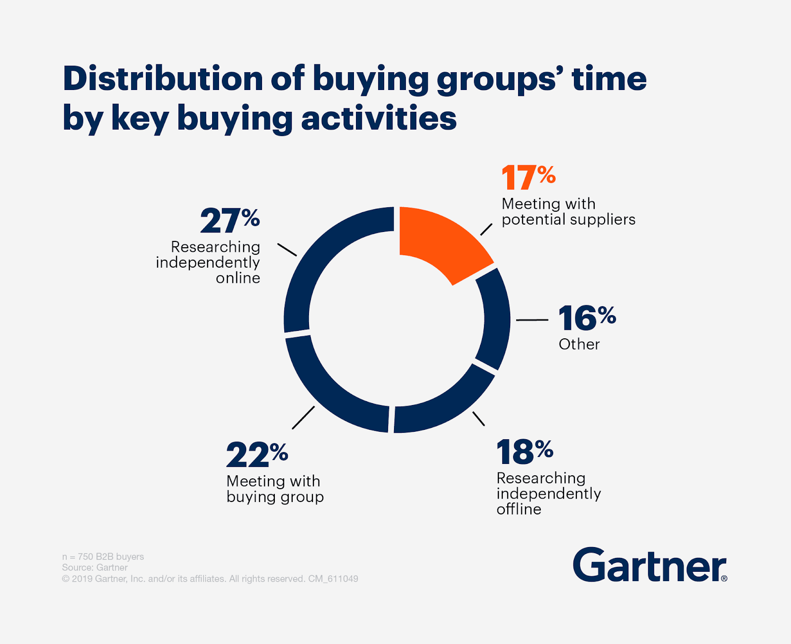
Notice how B2B buyers spend much more time doing their own research online than directly interacting with sellers like you. At Idea Grove, we describe this path to purchase as the trust breadcrumb trail.
This is why you should limit the content of your landing page to the most important information you need to get through to your audience. If you inflate your landing pages with superfluous content, the more meaningful content gets diluted – or worse, completely hidden.
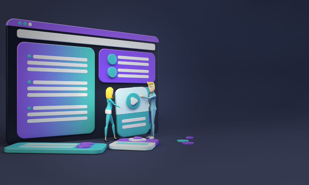
3. Use Video to Catch and Retain the Attention of Visitors

Videos are a great way to engage with website visitors and help explain complex concepts quickly. In fact, studies have shown that people are more likely to watch a video than read text on a website.
Videos are also a great way to build trust with potential customers. When creating videos for your website, make sure they are high quality and informative. Also, don’t forget to add transcripts for people who prefer to read instead of watch.
Even if your company only offers a service, and you do not sell a product to demonstrate, you can still have your team members in the office record videos about their work and about your company (these are sometimes referred to as company culture videos).
There are many types of video content you can create, so we recommend experimenting and A/B testing to see what works for you, your industry, and your customers.
4. Use High-Quality Images
The quality of the images on your website is very important. If you can use high-quality, professional images that are relevant to your business, your website will look much better and stand out from the crowd.
Be careful not to go overboard, though. Too many high-quality images can slow down your website, and slow loading is detrimental to your website’s performance. One study even shows that website conversion rates drop by an average of 4 percent points (!) with each additional second of load time (between seconds 0-5).
We recommend using image compression tools (many of them are free and readily available) to decrease the size of your images while keeping their quality basically intact.
5. Use Infographics

Infographics are a great way to communicate complex information in a visually appealing way, and there’s good data to prove it. SlideShare analyzed more than 1,000 infographics uploaded to SlideShare since launch, and the results showed that:
- Infographics are liked 4x more than presentations, and 23x more than documents on SlideShare.
- Infographics are shared 2x more than presentations, and 3x more than documents on other social networks, such as LinkedIn, Twitter and Facebook.
If you can create interesting and informative infographics, your website will stand out for sure, and your content will have a much better chance of reaching a wider audience.
There are lots of different ways to make infographics. If you want to do it yourself, there are plenty of free online tools that can help you get the job done. Canva is a great option, and they have a wide variety of templates that you can use to create your own infographics.
6. Tell a Story With Your Website Design

Telling a story is a great way to connect with visitors on an emotional level. If you can find a way to tell a story through your website, you will definitely stand out.
It can be difficult to tell an engaging story that simultaneously conveys your value proposition, brand identity, and competitive advantage. But if you can pull it off, it will be worth it.
Here are a few ideas to get you started:
Use case studies as part of your website design. These are stories that highlight how your company has helped others in the past, and they can be very persuasive.
Use images and videos to tell a story. A picture is worth a thousand words, as they say.
Use your "About Us" page to tell the story of how your company got started. Good stories often answer:
- Why did your company launch and what problems are you really solving?
- How and where did you start?
- How far have you come?
- Who do you do business with? Are your present and past customers satisfied?
If you can tell a great story that indirectly explains how your product or service solves the problems of your potential customers and improves their lives, you’ll be hitting a home run, because you’ll also be using the very first method discussed above.
7. Make Your Content Easy to Find
Thoughtful, simple website navigation is essential if your business offers a wide range of products and services. The bigger your website gets, the more difficult it gets for customers to find what they’re looking for.
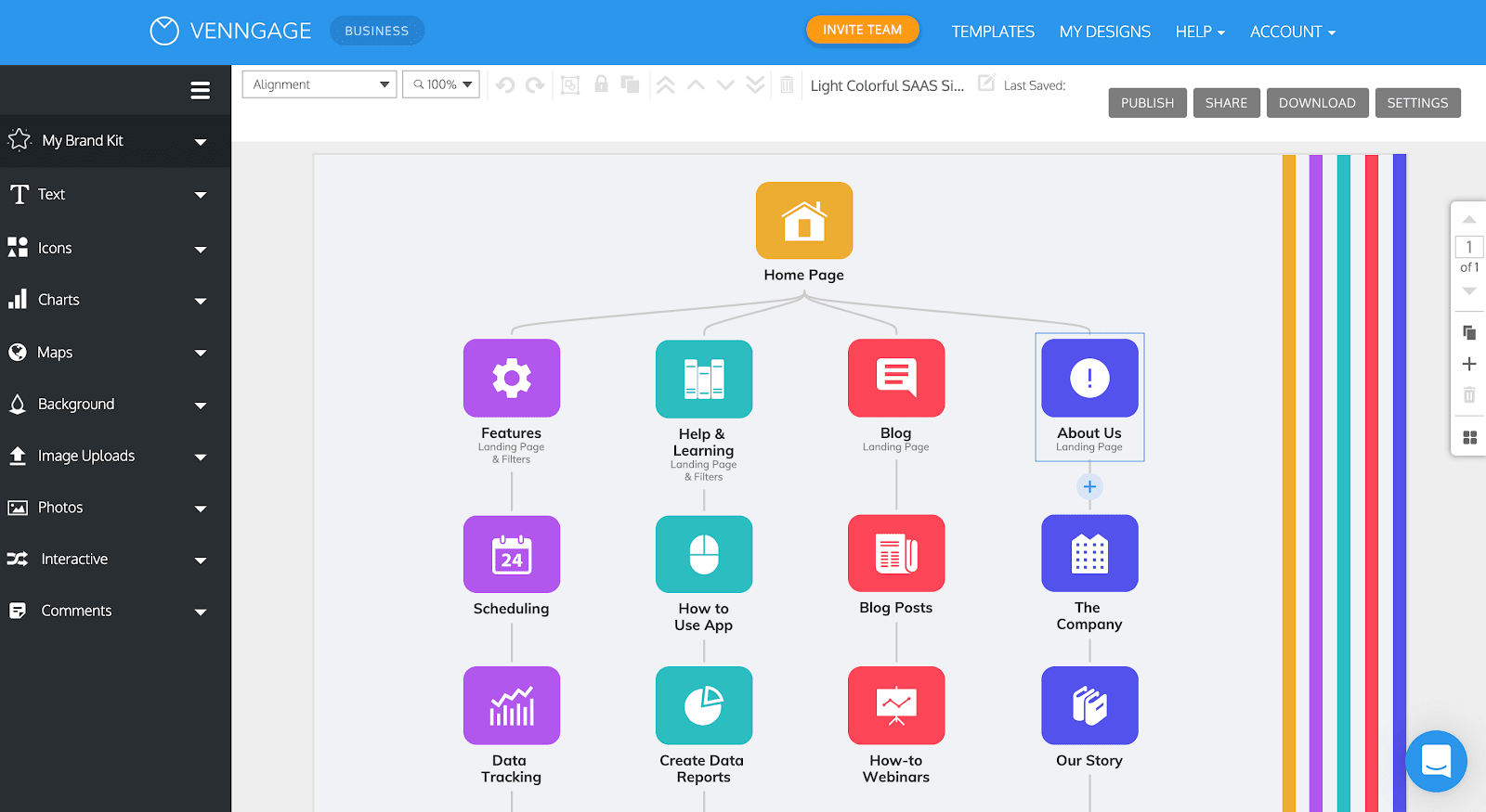
That's why we strongly recommend creating a sitemap before you dive headfirst into creating your website. Simply plot out how you would want a visitor to seamlessly navigate through your website, and use that as a foundation to organize your website with its menus and web pages.
Tools like Venngage are a great place to start because they give you customizable templates which you can use to create your sitemap:
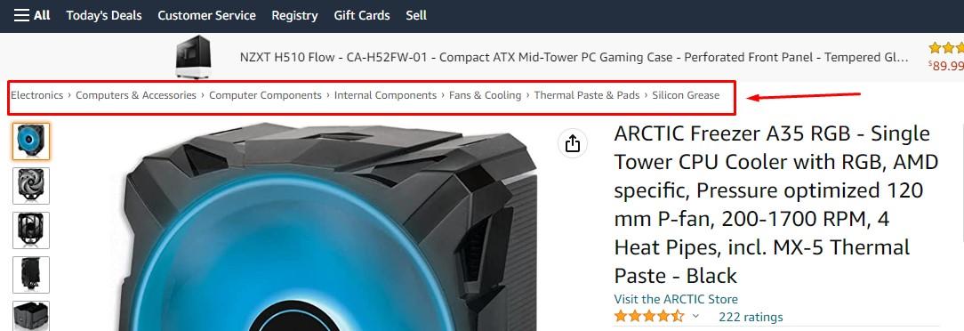
If you have a really content-dense website, it’s also advisable to add navigational breadcrumbs to your website. Navigational breadcrumbs basically reveal the user’s location on a website. You’ve probably seen them many times before because they’re widely used across websites like Amazon:
8. Use Vibrant Colors (But with Balance)
B2B websites are often used to present a highly professional image for the business, which is why companies often choose safe imagery and colors. It's why so many B2B logos and websites use the color blue, since it is the color most closely associated with trust.
But part of branding is also being different. Since it is unusual to see a B2B website take risks with things like color palette, illustrations and animations, you can take advantage of that and experiment with vibrant colors as a way of standing out and making lasting impressions on visitors. Just do it with enough finesse and balance that your visitors still take you seriously.
9. Add a Chatbot
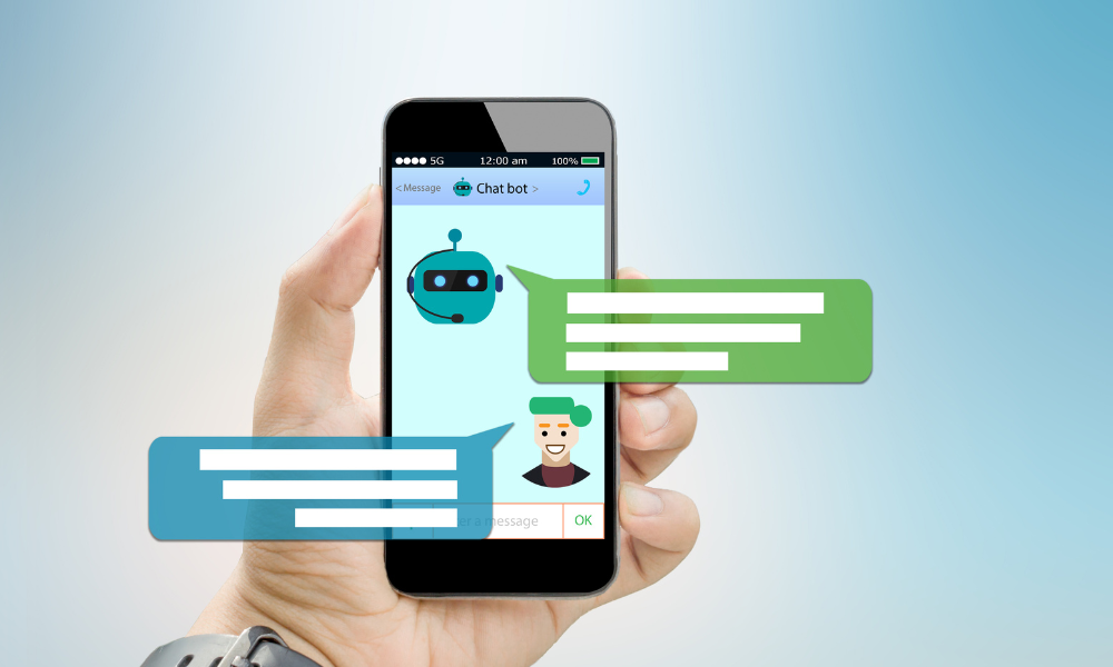
Gone are the days when chatbots were a novelty. Today, chatbots are not just common, they are expected. Insider Intelligence even found that nearly 40% of internet users worldwide prefer interacting with chatbots than with virtual agents.
Many businesses get chatbots wrong, though.
One common mistake is that chatbots don't have enough FAQs and saved answers. If a chatbot can only answer 2 or 3 questions before referring the website visitor to a human agent, then the chatbot isn’t prepared to handle many customer concerns.
You can avoid that by compiling a large list of questions you receive frequently and feeding it into the chatbot’s system. It's even better if you expand this list with new questions from time to time.
Another common mistake is making them too intrusive. Businesses will often overdo their websites’ chatbot widgets by adding alarming sounds, large animations, or frequent dialog pop-ups that can negatively impact the user experience or even seem unprofessional. Avoid all of these things. Try to keep your chatbot and its relevant widget uncluttered, and place them on the bottom-right corner of your web pages (a very traditional placement).
10. Personalize Website Copy to Each Customer Segment

Personalizing a B2B website’s copy to each customer segment can help your website stand apart as it adds the human touch that is often lacking in uptight B2B websites that try too hard to come off as professional.
Furthermore, compelling and personalized copywriting has a clear positive impact on websites’ conversion rates, at times even doubling it.
Our advice is to carefully define your buyer personas – think about who they are, what they do, and what they want – and create distinct landing pages for each customer persona or avatar.
From there, use search engine optimization and paid advertising to target different customer segments with personalized landing pages that make your potential customers feel like you're addressing them personally. This is in stark contrast with what they’ll be getting from websites that address all their visitors in the same exact way.
11. Navigate Your Website With a Search Bar

Having a search bar is practically essential. Even if the website itself isn’t very content-rich, it would be a mistake to assume that a search bar isn’t necessary because it adds little value. This is because the search bar in itself has value.
This might not be intuitive, but it has to do with a UX (user experience) principle known as Jakob’s Law. This principle states that users spend most of their time on other sites, which is why they prefer your site to work the same way as all the other sites they already know. Familiarity makes navigation simpler and enhances trust.
As an added benefit, you can store search queries in a database, so you can review them later on to find out how your website visitors are using the search bar and – more importantly – what they are looking for.
On a side note, on B2B websites, the search bar shouldn't be overly prominent. A good way to do this would be to have a search icon in the upper right corner of the website that only appears when you hover over it.
12. Freeze the Screen While Loading With a Lazy Loader
Lazy loading is a technique that loads images, videos, and other media in the background while the user is interacting with the initial content. It's a smart way to get around one of the most common problems for websites: unresponsive slowness.
This subtle but effective technique allows users to browse your site without waiting for all of your content to load.
This means they can quickly engage with what matters most on your page, like reading an article or watching a video, without having to watch a progress bar slowly creep across their screen – especially because many website visitors may not have the patience to wait for the progress bar to reach the finish line.
It also makes your website appear more responsive by decreasing load times and improving its overall performance.
13. Use Icons To Do Some of the Talking For You
Icons are criminally underestimated in web design. They’re small in size but not in impact, because they have a whole range of advantages. When used correctly, these visual anchors help capture the user’s attention and direct them to perform the targeted action. Icons help to:
- attract attention
- communicate meaning
- navigate the interface
- save visual space
- make a connection with the user
- summarize and decrease text
There are many websites that offer professional, free icons that you can use across your websites to reap the above benefits. A great place to start would be Flaticon.
14. Keep it Clean and Simple

A key benefit of simple design is that it is timeless. Consider this example: among the list of the world’s most expensive road-friendly cars is Bugatti. Bugattis are known for their stunning designs and equally stunning performance.
It may come as a surprise to learn that Bugattis, with all their hyper-advanced features and engineering, do not have screens. That’s right, world-class vehicles lack what’s become commonplace among low-to-mid level vehicles around the planet.
Why? Because screens age quickly. Look at a screen that’s 10 years old. It probably got outdated 5 years ago. And look at one that’s 20 years old. You might think it belongs in a museum.
Bugatti does this on purpose – they want their cars to be timeless, and you should do the same with your website. In an age when new technologies are popping up all too frequently, it can be tempting to overload your website with the newest and greatest tricks in web development. We strongly advise against that. Keep your website clean and simple, and it will stand the test of time.
If you’re not convinced, just keep in mind that simple design:
- Is easier to read and more accessible
- Loads faster
- Improves conversion rate
- Builds trust
15. Incorporate Calls to Action Throughout the Website
A Call to Action (CTA) guides visitors to the next step on your website. B2B companies, especially those with complex sales funnels, need to spread carefully-placed CTAs throughout their website. Without that, they’d risk having visitors get lost or leave the site before taking the right step.
A great example of a website homepage that offers well-crafted and well-placed CTAs is Asana's:
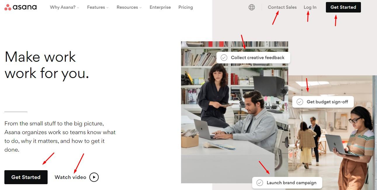
Take note of how their CTAs are:
- Straightforward, clickable and encourage the user to receive benefits only at the cost of a few clicks
- Scattered throughout the webpage
- Obvious but not intrusive or pushy
- Above the fold (meaning the user does not need to scroll down to see them)
16. Use Consistent Fonts, Colors, Images and Language
Strive towards uniqueness by making your web pages different from those of your competitors. Strive towards professionalism by making your own web pages similar to each other.
The fact that we’ve emphasized the importance of testing out vibrant colors and personalized copy does not mean that you shouldn’t keep the elements that make up your website consistent. Why? Because it’s been proven that consistency is key – especially to improve conversion rates.
This includes the website’s:
- Landing page
- Thank you page
- 404 error page
- Calls to action
17. Use Email Signup Forms and Contact Forms
Some best practices, especially in B2B, for moving your website visitors from "aware" to "interested" in their customer journey are collecting visitor emails via sign-up and contact forms. This allows you to follow up with visitors who've already shown some interest in your business and lead them further down the sales funnel.
While you'll often find "Buy Now" or "Add to Cart" on B2C websites, it's just as common to find "Learn More" and "Contact Us" or something similar ("Contact Sales") on B2B websites for this reason.
18. Add Social Proof and Testimonials
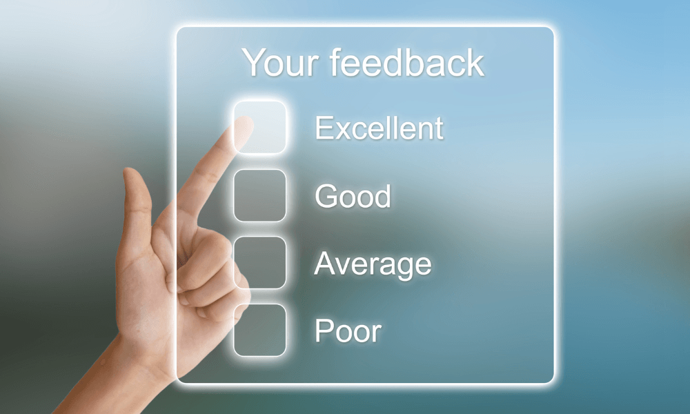
Featuring social proof and customer testimonials on your website is a great way to create a bandwagon effect and build trust with potential customers.
If you have any notable awards or recognitions, be sure to showcase them prominently on your site as well. Potential customers will feel more confident doing business with you if they can see that you're a reputable company and that others have had positive experiences with you. A great way to do this is by embedding reviews from Trustpilot, TrustRadius, and others on your website.
Final Thoughts
Designing a website can be daunting, but it’s important to remember that simplicity is key. The best B2B websites aren't effective because they are flashy or "cutting-edge"—they work because they communicate your message in a way that establishes familiarity and trust.
So, if you’re feeling overwhelmed as you start the design process for your B2B website, take a deep breath and use these 18 tips. And remember: don't be afraid to do some experimentation to find out what works best for your customers and your industry.
 8 min read