
 8 min read


So you’ve created your amazing business-to-business product and you’re starting to gain more and more clients, but you start to notice a plateau. Perhaps all your new customers are finding you from your direct marketing campaigns or you notice that you have a super high bounce rate. What gives?
One thing so many B2B companies overlook is their website. When you have a high bounce rate or low number of customers finding you organically, one thing is most likely true: your website is falling flat.
And with your website being one of the primary ways that you generate new business, that’s something that needs to be addressed ASAP.
In this guide, we’ll give you specific ways to improve your B2B website design for the most effective results.
The Philosophy
When a potential customer visits your website, this is often their first impression of your brand. If it isn’t the first, it's probably their second or third impression — maybe they heard about your product at a conference and are finally sitting down to check it out.
Either way, this impression is incredibly important. If that person finds your site difficult to use or experiences slow page loading, for example, their trust in your product takes a hit. They are that much less likely to recommend your product to their business.
That’s why we think trust-centered web design is so important. This approach focuses on developing a relationship with your buyers through their use of your website by providing a high functioning, well-designed site that demonstrates an understanding of their needs and encourages engagement and interaction.
Your website's purpose isn't just to sell product or collect leads. It has a larger role: to build affinity with your visitors in the same way that a salesperson might build rapport with you before completing a sale. As such, it’s critical that you prioritize making your site feel like home for visitors.
When your customers are frustrated with your website, it means they are frustrated with your business. To keep that from happening, put trust first in your mind’s eye while you’re designing.
The Method
So how does one put trust first when it comes to B2B user experience? It isn’t just about creating a site that never crashes — though that is important. It’s also about creating an experience that consistently sends the user signals about why they can trust your business — and when it comes to B2B products, this trust is paramount.
The method behind creating a great B2B website includes lots of elements, but we’ll cover the basics here.

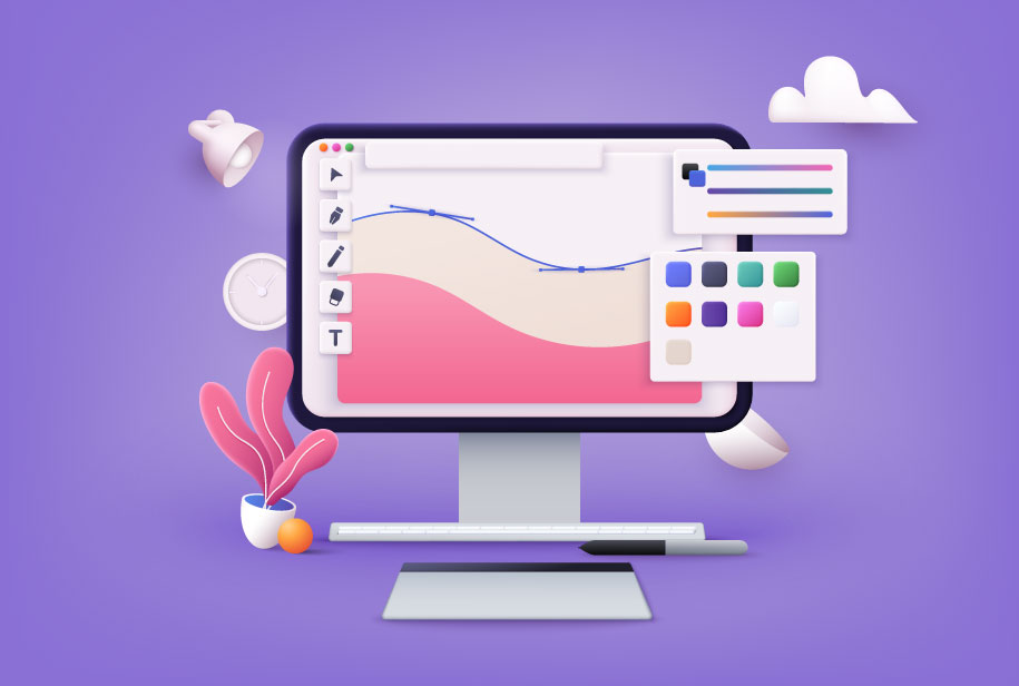
Graphics and Imagery
When it comes to first impressions, the way your website looks is absolutely the most important thing about your B2B site. This is the first time visitors will become acquainted with your brand, so make sure it’s consistent and in line with your messaging.
You want the colors and imagery on your site to be sleek and approachable. If you use a gray background and black text, for example, some users might not be able to read your site because of contrast issues. Make sure you have contrast between the text and the background of your site — and these colors should match your brand, too!
Graphics really enhance the experience of visiting your site. Show your potential clients what using your product could look like with photos of real people in the appropriate setting.
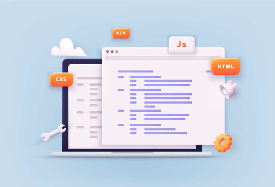
Illustrations are also helpful, especially when it comes to describing what your product is. Hire an artist to illustrate use of your product. If it’s a sales program, for example, use a combination of screenshots and illustrations to show how businesses will be able to use that program.
These illustrations should be in line with your branding, of course. Make sure to always prioritize diversity in any imagery you use on your site, so every potential client could envisage themselves using your product for their business.
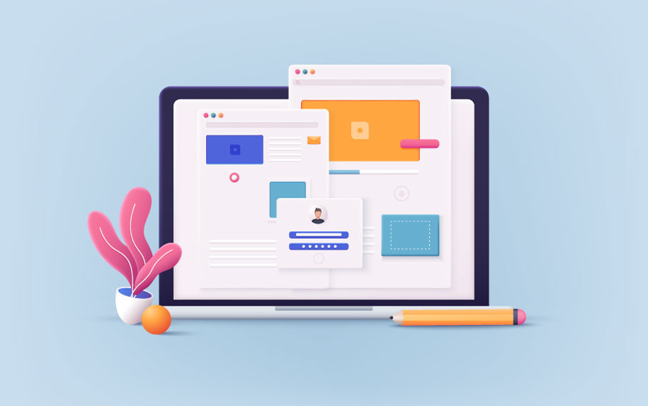
Navigation and Organization
When it comes to organization, a well-designed website should be visually oriented. Using a hamburger menu, for example, makes your website seem more streamlined and organized. Test this navigation on someone who isn’t familiar with the site or product to see if the way you’ve laid out your site is intuitive.
As you lay out your site, you might find that the website experience feels circular — like every time you visit one page, it links you back to a page you’ve already visited. This can lead to a really frustrating experience for the user.
To avoid this, use consistent language so that the user can reasonably assume where they are navigating when they click on a certain link or menu item. For example, if you refer to your services page as “What We Do,” don’t link to it using the phrase “What To Expect From Our Product” later.
Unlike the approach of the early 2000s, you should assume that the individuals visiting your website are smart enough to figure out the basics — especially for a B2B product. Organize your site simply and elegantly, in a way that makes sense to the average internet user or industry professional in your field.

Content
When it comes to the actual content of your website, it’s important to make sure your copy is consistent, free of grammatical errors, and easy to understand. In terms of design, though, writing copy takes on a whole new meaning.
If you are posting a lot of content on a single page, make sure to write short, easy-to-understand paragraphs that are easy to scan. Use headers and subheaders so that users can scroll and find what they’re looking for easily.
This is also handy for the visitor that uses Ctrl+F to find the content they’re looking for. When you use headers, you’ll send the user to the top of that section, rather than the middle of a paragraph. This means less missed information and a more pleasing user experience.
For pages with fewer words, make the content sleek and easy to comprehend. Use lots of graphics to portray information at a glance, while also making sure the words that do appear on your page are meaningful and precise.

Testimonials and Badges
Testimonials are trustworthy appeals from, ideally, high-profile customers about how your product made running their business easier. These testimonials can be from individuals you’ve worked with, CEOs of your client companies, or experts from the industry your product falls in.
These comments should appear on your site to tell the user that other people — trustworthy people with successful businesses themselves — trust and use your product. It’s best to include these on every page that also includes a click-through or form. If the visitor is hesitant to provide their email, for example, seeing a testimonial from a business they like could nudge them in the right direction.
Similarly, trust badges tell users what to expect from your product. Badges are graphics that denote a promise or feature of your product. Think free shipping, 24/7 customer service, or satisfaction guarantees.
These badges don’t take up too much space on your site, and they’re easy for the visitor to comprehend without giving them a big block of text. Badges say, “This is an important aspect of our product,” which implicitly tells the user that you understand their business’s needs.
Chatbots and Forms
When you place a chatbot form at the bottom of each page of your site, you’re removing a lot of blocks between a user visiting your site and actually purchasing your product. If they have a quick question, or one they can’t find an answer to, these low-cost bots can answer quickly and efficiently.
This is especially important for B2B companies because each of your customers has specific needs. Instead of having to call a customer service representative, the potential client visiting your site can have their more basic questions answered immediately.
It’s also a good idea to ask for personal information in these contexts — like when a user navigates to the FAQ page, after they finish a chat with a bot, or at the end of a blog post about your product.
Make sure you don’t ask for this information too quickly. This starts to feel scammy or even sometimes just lazy, like you care more about getting their information than you do about making sure your product is a good fit for their business.
Overall, you want these bots and forms to be helpful to your user rather than frustrating or annoying. Visitors will be much more likely to give you personal info, which gets you that much closer to landing them as a client, if they feel like they can trust that you won’t exploit those details.
Conclusion
All in all, designing a great B2B website has everything to do with being true to your brand and, in turn, generating trust between your business and the businesses you serve. When you prioritize great imagery, intuitive navigation and relevant content, users will have an experience that builds affinity with your brand. Don’t forget to continue building trust and fostering a relationship with your clients by incorporating thoughtful details like testimonials, badges, chatbots, and forms.

 9 min read