
 6 min read


She peers hopefully into the screen, waiting. As the page loads, her face suddenly contorts. Did someone scream? There was definitely a noise. She is shocked and immediately pushes the horror away. "I'm never visiting that website again." she says with disdain.
It may sound like a lame campfire tale, but evoking this type of reaction from users on a poorly executed website is a real danger. Your website visitors have visceral, emotional reactions to the experiences you create all the time, and ignoring these can be detrimental to your marketing efforts.
Here's a list of the things that keep me up at night when I see them used poorly in website design.
Note: All identifiable information has been removed in these examples in order to protect the innocent victims of these web design crimes.
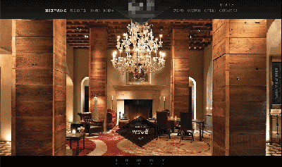
1. Sound That Autoplays
Any time you create a user experience that removes the user's ability to choose, you are degrading the quality of that exchange. Instead of bombarding your visitors with your company's theme song, default to having sound off, and allow them the option to turn it on if they want to. This simple switch can prevent your users from reacting negatively to that experience you're creating with the best of intentions.
Creating video? (You should be!) Consider including subtitles with your videos, providing bullet points in your page copy for added SEO benefits, or even using timestamp links that can make navigating long video content a breeze. For social media, 85% of users watch video without sound, so it's safe to assume your website visitors have a similar preference. Your users will appreciate being given the flexibility to enjoy your content in a way that works for them and is more accessible.
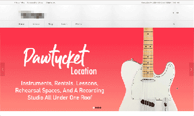
2. Non-Responsive Websites
In 2019, mobile traffic accounts for approximately half of web traffic worldwide, so your website should be responsive. By non-responsive websites, I am referring to websites that do not automatically respond to the screen size or device that they are being viewed on. In the web design world, mobile first-design has been considered common practice for a while now, but I'm still surprised by how much of the web hasn't been optimized for mobile viewing.
In the example below, certain aspects of the website are responsive, but the user is still going to have a hard time navigating. How does one select those tiny links with a fingertip?
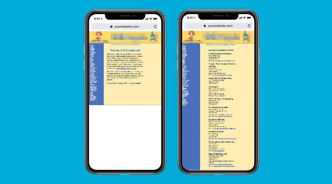
It's important to take your user's screen size into consideration, but I recommend going even further. If your user is on their mobile device, think about what they would find useful in that situation. For our B2B technology clients, a user visiting on their mobile phone might be in a meeting without their laptop, or pulling up the website from an email they received. In that situation, brevity is your best friend. Make sure it's easy for that user to find what they are looking for and remove extraneous information.
3. Parallax Scrolling
Parallax is an effect created by coding elements to move at different speeds when the user scrolls. This trend in web design has been around for years, and can make for really interesting and immersive experiences. Used poorly, parallax scrolling can generate a jarring experience, resulting in a quick exit from your viewers.
To avoid misuse of parallax scrolling, make sure that you use it in a way that improves the user experience without disrupting it.
4. Pop-up Overloads
Have you ever been to a website and been inundated by so many pop-ups that you felt personally attacked? With live chat, cookie notifications, requests to turn off ad blockers, and of course a request to download your latest eBook, it can be downright scary for a user to visit a website with pop-up overload for the first time.
Most pop-up creation tools allow you to set parameters, and we recommend using these for every potential situation a web visitor might face. Take your user's experience into consideration with each pop-up you implement, and make sure you aren't allowing them to overlap.
For B2B websites, the most common over eager pop-up situation I see occurs on the user's very first interaction with the website. When they land on your home page and are asked to accept the website's cookies while simultaneously receiving an automated message from live chat - it can be a turn off. Visit your website from an incognito window every now and then to simulate the experience a brand new user will have when they visit for the first time. Put yourself in their shoes, and imagine what they may be feeling.
5. Image and Text Sliders
In theory, there's nothing wrong with using an image and text slider. In practice, this overused website function creates a bland experience for your user. The problem with the generic slider is simply in how mundane and overused they are. User engagement with sliders is typically extremely low, and if you don't see much conversion on your home page CTA, it might be time to find a more creative way to capture your users' attention. Keep in mind that you have mere milliseconds to make that first impression with a new visitor, and use that real estate wisely.
6. Hard to Read Text
This one is pretty simple. Make sure your users can actually read your content! I see a lot of website design that focuses too much on what looks good, and ignores the functional reality of why that content exists in the first place.
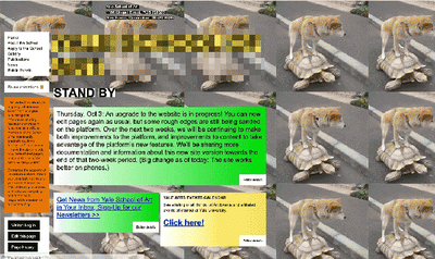
7. Busy, Over-Designed Pages
This example really speaks for itself, so I'll just let you gaze upon it and listen to your own internal screaming.
8. Infinite Scroll or One-Page Sites
One page scrolling websites became really popular a couple of years ago because they are easy to create and give the user a seamless experience with a shorter load time. They work really well in certain circumstances, but for most company websites, one page is simply never going to be enough.
Reserve the microsite format for content that focuses on one subject, like a landing page offer, or an event promotion page. Search engines take the volume of your content into consideration, and the more topics you touch on across your site, the more authority it will grant you in that area.