
 6 min read


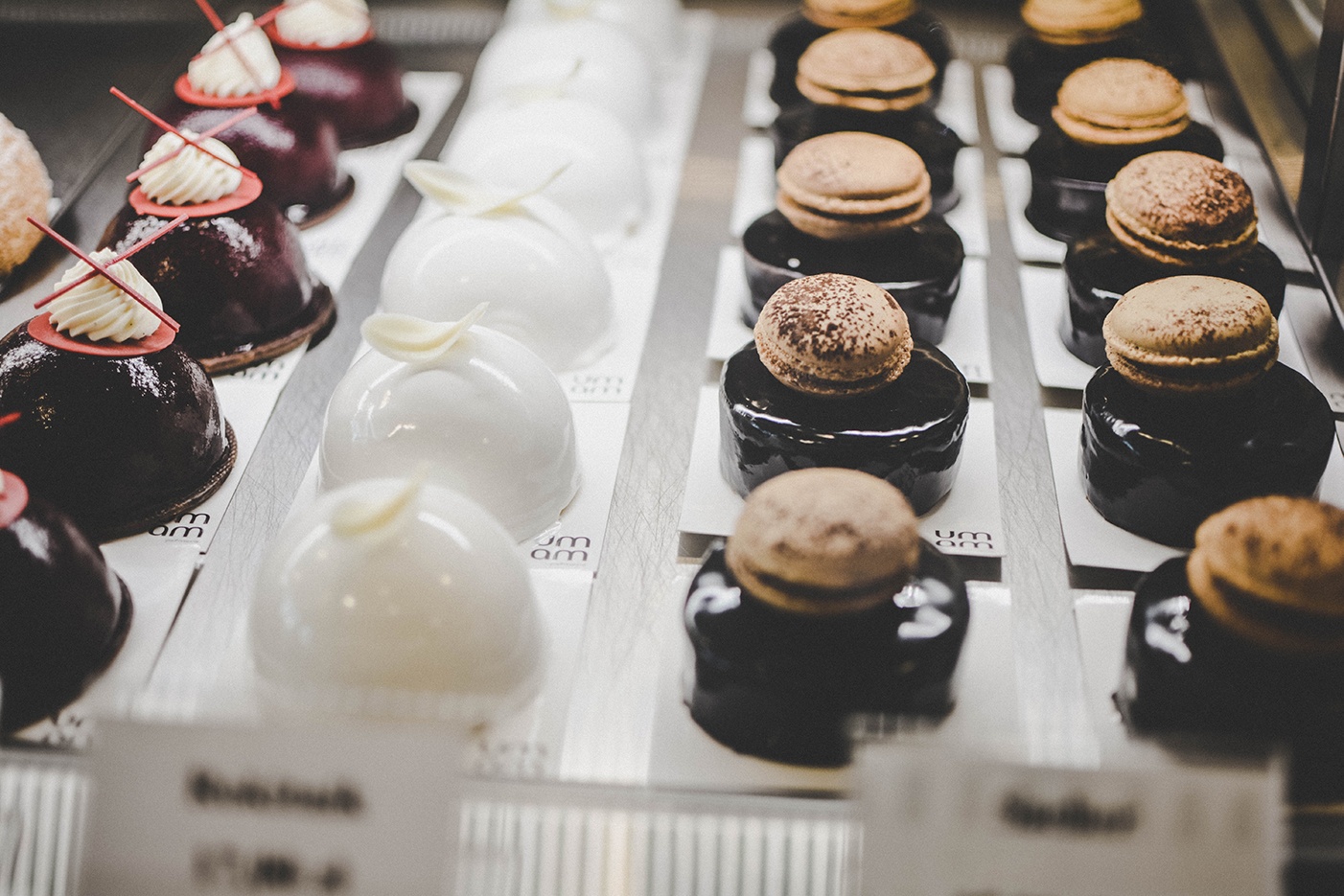
I recently chose to make my home in Mérida, in the northwestern Yucatán peninsula of Mexico. To look at me, you’d think the main reason is because I love the food here. In fact, the area is becoming a mecca for foodies from around the world. And the desserts? Just browse the web to find photos of creations so tasty you’ll want to jump on a plane.
But no matter where you go or how elevated the culinary scene, you’ll find that some of the most scrumptious-looking creations can leave you wondering, “What happened?” For example, last week I picked up what looked to be the perfect, flaky pastry—only to find it was dried out and had no flavor. And I’ve sampled more than one tres leches cake that, despite their outrageous, colorful decorations, tasted no more special than any other everyday cake.
Whatever the food or location, sometimes when you get beyond the surface, you realize that the flavor just isn’t there. You leave the table unfulfilled, and the restaurant owner is left scratching his head, wondering what happened.
Is something similar happening with your website? Are visitors dazzled by your unique visual presentation, only to discover there’s not much flavor under all the pretty frosting? Here are five additional, yet crucial ingredients your website needs to be a more effective marketing tool.
Go for a distinct—not distracting—look
Everyone has come across websites that incorporate every type of visual element possible. It’s like a cake with so many competing decorations, swirls and colors that, frankly, you have no idea what flavor it really is. What’s more, it is so “busy,” you’re soon so distracted you don’t remember why you visited in the first place. So, even if you have a more compelling message than your competitors, it gets lost in the visual confusion.
Make sure you develop a pleasing theme and style guidelines and stick with them. You want the visitor to feel at home, so they can consume the message and content you’ve carefully prepared for them.
Organized menus: Make it clear what you’re serving and why
You’ve picked just the right theme, colors, style elements, images and fonts. Now, how does your visitor navigate the site? Just like the local bakery, you need to present an organized menu of offerings, not a display case full of unmarked treats in a random jumble. Without simple, intuitive menu choices, it’s hard for the visitor to know where to go to find just the piece of information she’s looking for.
Your navigation should be simple and clear, without too many options on any one menu. Show the user broad categories, like Solutions, Industries, Resources and About, then let submenus (or subpages themselves) intuitively lead the visitors to the exact page they are looking for. And remember that not every page has to appear directly in a menu or sitemap.
A consistent message: What (one thing) are you really trying to say?
Ever gone into to a restaurant that serves one special cuisine, then the pastry cart comes by with a little bit of everything on it? Italian shaved ice, Mexican flan, bananas Foster, lychee mousse with Siracha and, the obligatory chocolate cake. That might work if the restaurant was a “we make whatever you want” affair. But if your message is specific—like “the greatest Yucatecan food on the planet”—your customer might suddenly be confused.
Make sure your readers know “it’s you” with a consistent message. Even if you have wide-ranging products and services, you don’t want visitors to experience “whiplash” from one page to the next, being unable to figure out what you really stand for. Take the time to define a messaging framework with a central, unifying central message and a set of supporting tenets that pervade the content across not only the site, but all marketing content.
Calls-to-action: What’s the next course?
So, hopefully your website has served up a feast for the eyes and gotten your prospect’s attention. Now, what’s next? Would you present a dinner guest a menu that stops after the appetizer course, making them have to ask what else you have available?
If your website doesn’t present clear calls-to-action, that’s what can happen. Sure, many users will dig around using the navigation menus and the search bar to see what else they can find, but why make them do that if they’re hungry? Each page should have at least one clearly marked “next step” for that user. The home page (and most higher-level pages) should have more than one, to help new visitors zero in on the content that most interests them. Whether it is to “Find Out More,” “Signup for Our Blog,” or “Download Our Latest eBook,” never leave your visitor at a dead end, wondering where they should go next.
Something of value to offer (and it’s not necessarily your product)
Does your web content dive right into you and your product details? That’s not the case with the websites we design and write for our clients. When visitors land on those home pages, they first read about themselves and the problems they deal with on a daily basis, then about how our clients’ products and services offer better solutions.
For B2B tech companies, the buyer’s journey can be a long one. Your website has to nurture the buyer through the awareness stage, through the consideration stage and the eventual decision making. That means you should offer helpful information and thoughtful insights—not just salesy copy and technical specs.
Offer some valuable tips in the form of an eBook or interactive infographic. Present a new perspective in a free whitepaper. Help the prospect evaluate their own situation with an insightful quiz and customized report. All these pieces can build trust and then guide prospects to the nitty gritty spec sheets and technical details when they are ready for them.
Add the right ingredients for a living, breathing website presence
I hope your website is a visual feast for your visitors. But is it as effective at attracting, qualifying and nurturing leads through their buyer’s journey as it could be? It could be that, like so many eye-catching desserts, it is missing one or more key ingredients to make everything work well together. And lacking those elements, your site could end up stale, static, and—well, tasteless.
All these elements combine to make your website a living, breathing presence, one whose design, function and content are continuously improving over time. And since your website is the cornerstone of your marketing efforts, shouldn’t it taste—er, read—as good as it looks?
 3 min read